HENK

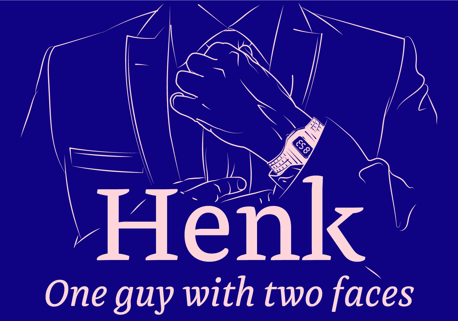
"Henk Work" is a smart, hard-working, sharp-dressed gentleman designed for writing long legal texts.


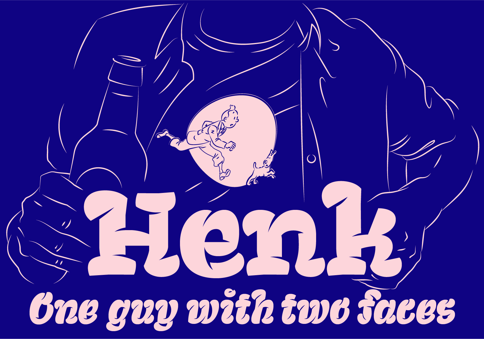
"Henk Out" can be noisy but relaxed and entertaining. He is a type for larger scale texts.


Henk has six different styles with the same DNA. Henk Work Regular / Bold / Italic is a text type designed for the formal use. Henk Out Regular / Bold / Bold Italic is designed for the use in shorter, informal texts and branding.


Henk is my final project from a very unique master course of TypeMedia at KABK.

    .

BIGGUY

The typeface is designed to use up as much of the space in the matric as possible. It was created to be used when working with photography and illustration, where it's used as a mask

SIGISMUNDUS

Sigismundus got inspired by a typeface that was used in a document by Sigmund, an archbishop of Vienna, from 1728. Sigismundus (R.,B.,I.) is a text typeface that shows off its luscious shape in its larger proportions. Sigismundus is "Baroque Nouveaux".

MODULAAR

Modulaar is a modular variable font. It's built out of three modules that can be easily varied and modified.

DYSDIZ

It's an essential element of a dyslectics' ABC book. It works as a physical object (foam letters) as well as a display typeface for a mobile application. DysDiz is a prototype typeface that young dyslectic children could start learning to read with.

DYSCONT

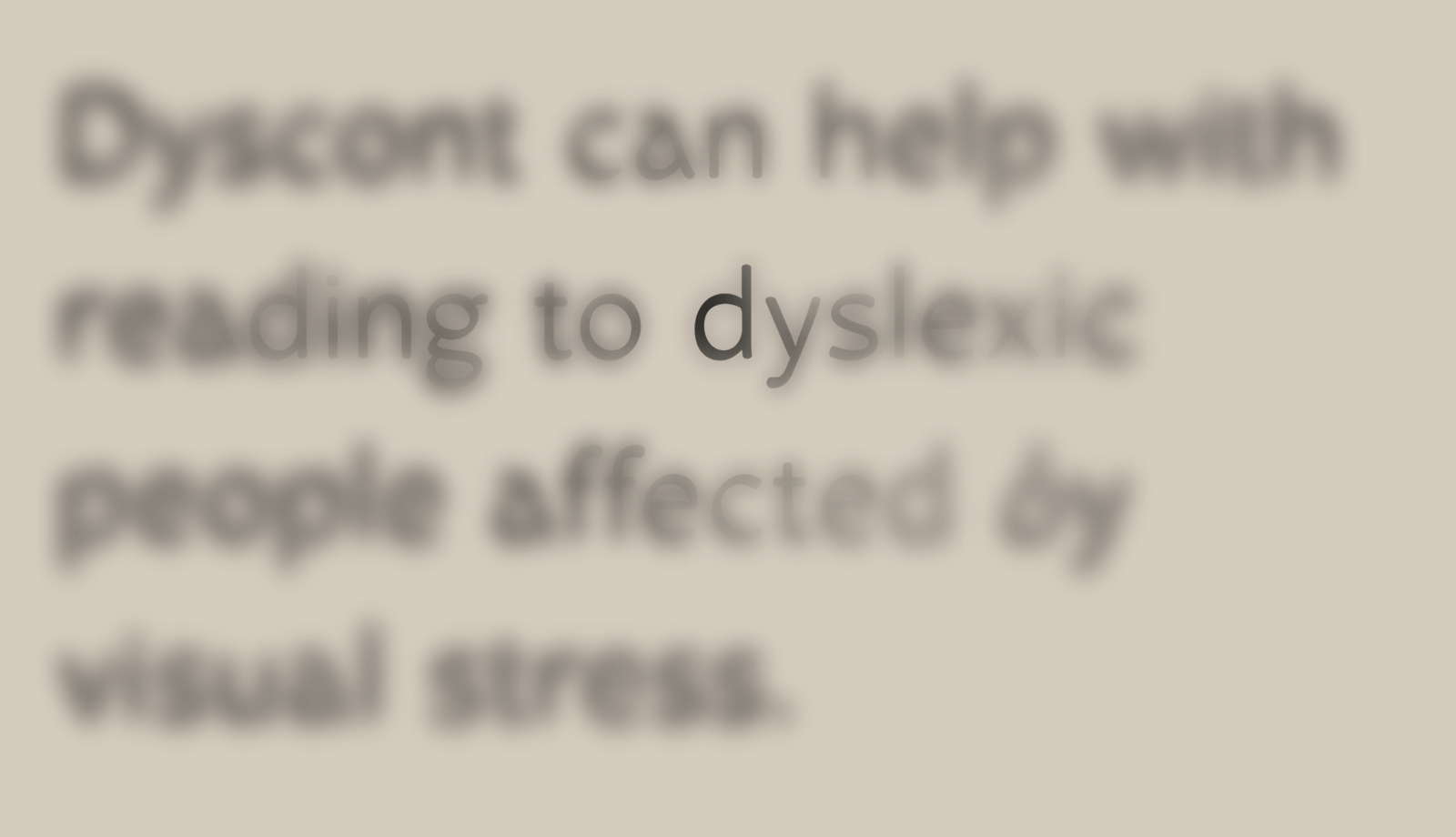
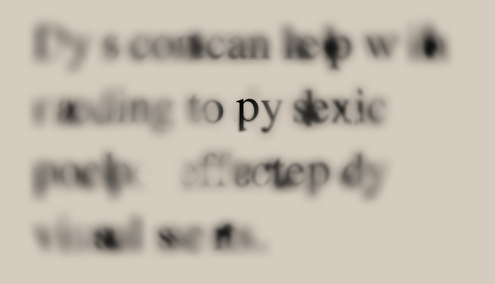
It's a text typeface that helps dyslectic people who suffer from visual stress alleviate their unpleasant feelings when reading.

© 2018 Martin Pyšný


„Henk Work“ is a smart, hard-working, sharp-dressed gentleman designed for the writing of the long legal texts.


„Henk Out“ can be noisy but relaxed and entertaining. He is a type for larger scale texts.


Henk has six different styles with the same DNA. Henk Work Regular / Bold / Italic is a text type designed for the formal use. Henk Out Regular / Bold / Bold Italic is designed for the use in shorter, informal texts and branding.


Henk is my final project from a very unique master course of TypeMedia at KABK.


The typeface is designed to use up as much of the space in the matric as possible. It was created to be used when working with photography and illustration, where it's used as a mask


Sigismundus got inspired by a typeface that was used in a document by Sigmund, an archbishop of Vienna, from 1728. Sigismundus (R.,B.,I.) is a text typeface that shows off its luscious shape in its larger proportions. Sigismundus is "Baroque Nouveaux".


Modulaar is a modular variable font. It's built out of three modules that can be easily varied and modified.


It's an essential element of a dyslectics' ABC book. It works as a physical object (foam letters) as well as a display typeface for a mobile application. DysDiz is a prototype typeface that young dyslectic children could start learning to read with.


It's a text typeface that helps dyslectic people who suffer from visual stress alleviate their unpleasant feelings when reading.

Henk is my final project from a very unique master course of TypeMedia at KABK.